
DIY Video Studio is supported by its readers who use the affiliate links or ads on this site. As an Amazon Associate, I earn from qualifying purchases. Thank your support if you use any of the links.
In my article, How to Create Subtitles or Captions in Premiere Pro, I explained the process of creating captions in Premiere Pro. If you follow the instructions, by the end you would have perfectly functional captions or subtitles. But they can be improved, and their appearance made much better. This article builds on what I have already described, with the objective of adding polish to the default look of the captions in Premiere Pro.
If you haven’t already created your basic captions, I recommend reading the article I mentioned above before continuing here.
Since you are still reading, I’ll assume you have created your captions and wish to improve their styling so they look good.
Example of Premiere Pro Captions Before and After styling
I want to show you how the default captions can look in Premiere Pro and how they can look once you have done some basic styling.
After clicking on Create Captions in Prem Pro, the app automatically created captions using the Minion Pro font and font size of 48.

You can see that the caption is very small and would be difficult to read, especially if viewed on a phone. I’m also not a fan of the Minion Pro font, I think there are better fonts for subtitles.
Here is the same caption but with some basic styling applied.
Because the subtitle is much easier to read, the viewer does not need to concentrate as much on the subtitle and therefore can see more of the video.
Check the capitalization of words
This first step is simple, but it can be the difference between your captions looking amateurish or professional.
Here I don’t mean capitalizing words at the beginning of sentences. I mean words or terms where all the letters should be in capitals or a certain combination of upper and lower case characters. For example, if I had been talking about the iPhone video app FiLMiC Pro, Premiere Pro would probably have had trouble transcribing it correctly.
To clearly illustrate what I mean, I’ll use an example from one of my recent how-to videos.
In the video, I mentioned “USB-A”, “USB-C”, and “OTG” several times. However, Premiere Pro transcribed them as “usb a” and “usb c” (it also made an error with the word “to”). Technically, that’s what I said, so full marks to Premiere Pro, but it’s not the way it’s normally written down.
In fact, here’s the caption.

Premiere Pro’s output was “a usb c two usb otg adaptor“.
Obviously, I could quickly edit this instance of the error, but I knew I had said “USB” a few times. It is easy to track down all the instances of “USB” by using typing “USB” into the search box in the Captions panel.
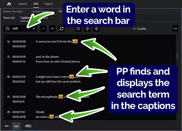
When I did the search, Premiere Pro found and highlighted every time l said the word. By using the Up and Down arrow buttons I could jump from one to the next to make changes.
Splitting and combining captions
If you do not like the way the captions have been created, you can use the Split caption or Merge captions buttons.
To split a caption, click on the caption you wish to split and then click the Split caption button. This creates two captions that have the same content as the original one, but each copy is half the length of the original. You can now edit each of the two captions, so the split looks the way you want.
The other option is to merge captions. This time, click on the second of the two captions you want to merge and then click the Merge captions button.
Formatting or styling your captions
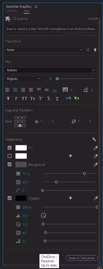
You can format, or style, the captions using the Edit tab of the Essential Graphics panel (shown opposite).
You can alter the:
- font
- font-weight (e.g. thin, regular, bold, etc.)
- font size
- text alignment (e.g. Left align text, Center align text, Justify, etc.)
- text tracking (the amount the characters are spread apart)
- text leading (the vertical spacing of the lines of text)
- other text characteristics (e.g. Faux Bold, All Caps, Underline, Superscript)
- caption block zone position
- caption block horizontal and vertical position
- text fill and stroke colors
- text background block color, size, opacity, and corner roundness
- drop shadow properties
In other words, all the usual formatting you can apply to text in Premiere Pro.
If you are unsure of what is the best font to choose for subtitles, I list the 7 best font options later in this article.
To format the captions, click on any caption block in the caption track. This will open the tools on the Edit tab of the Essential Graphics panel.
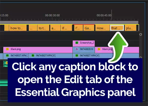
Next, drag the play head over the caption block you just clicked on. This will cause the text of that caption to be displayed over the video in the monitor panel.
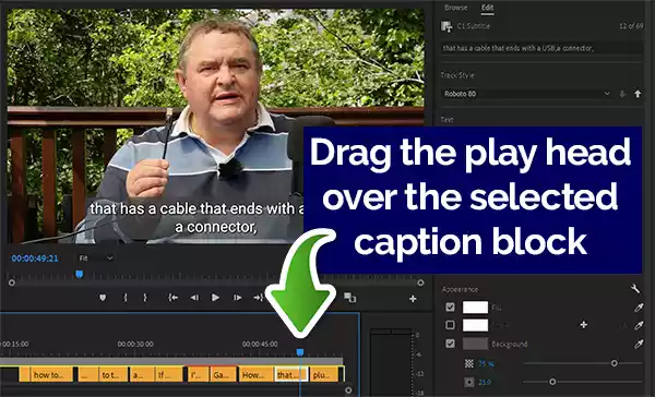
You can now try adjusting the various edit options to style the text.
Once the captions are to your liking, click the down arrow in the track style menu bar of the essential graphics panel. A drop-down menu will open, from which you should select Create style. This will cause the New Text Style window to open, where you can give the track style a name. Finally, click OK.
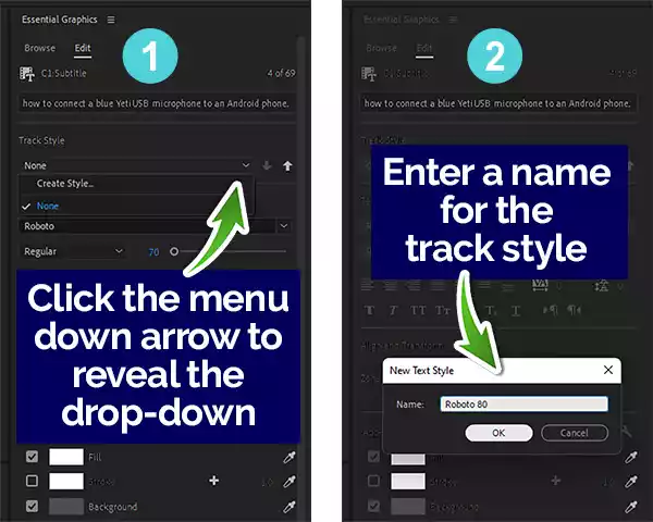
The formatting you applied to the one caption block will be saved as a track style and applied across all captions in the sequence.
Avoid splitting connected words across lines
Now that you have made the captions look attractive there’s just one last thing to do, which is optional since it must be done manually, and only needs to be done with two-line captions. I feel this step adds polish to the captions, which is why I have included it in an article about making your subtitles look good, however, you may feel it isn’t worth the time it would take.
This step should be done after you have applied the track style to the captions because that will affect how the text will now appear.
This is the reason why this step is optional, you need to check each caption, which will take a lot of time on a longer video. Your objective is to check whether words that belong together have not been split awkwardly between two separate lines.
Let me explain what I mean with an example. Take the following pair of two-line captions…
“Next, connect the other end of the mic”
“cable to the mini USB socket on the base of the Blue Yeti”
And…
“Next, connect the other end of the mic cable”
“to the mini USB socket on the base of the Blue Yeti”
Here’s how it looks in the video.
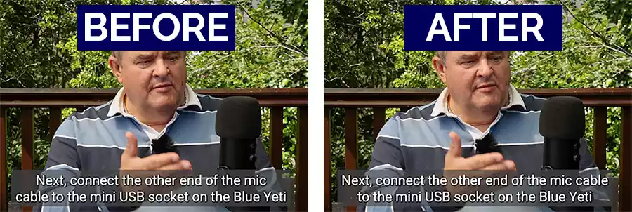
Although it is a minor change, I think changing the caption makes the meaning clearer. This is because “mic” and “cable” belong together since “mic” describes the type of “cable”. When the two words are separated, ambiguity is potentially introduced for anyone trying to keep up with the captions.
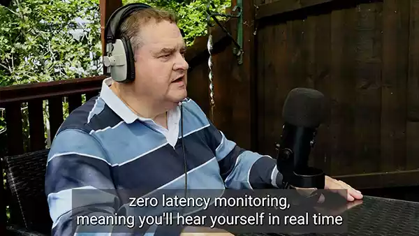
Although I’ve pointed out the effect of splitting two connected words across two lines, the effect can also occur across adjacent captions. For instance, in the video I’ve been using as an example, I also used the phrase, “zero latency monitoring”. Initially, that had been split so that “zero” was the end of one caption and “latency monitoring” was the start of the second caption. In that case, it was better to move the word “zero” to the start of the second caption.
If you do edit the captions, be aware that you will also have to adjust the position of the end and start points of each caption block in the caption track, so that they remain synced with the audio.
Congratulations. You’ve finished formatting your captions. Not only have you made your subtitles look much better, but the viewer should also find them easier to read.
What is the best font to choose for subtitles and captions?
I’ve shown you how to format your captions, and part of that is choosing a typeface or font. With so many free fonts available within Premiere Pro and thousands more available for download, choosing the perfect font for your subtitles can be an overwhelming task.
I explain some basic principles to help you choose, as well as list my seven go-to fonts for subtitles.
The guiding principle is to choose a font and style that the viewer will find easy to read and not unduly distract the viewer from watching the video content. So plain fonts are going to work better than complex-looking fonts.
Another factor to consider is familiarity. If a font is used extensively on websites, TV, magazines, and signage, then it might be a good choice. That’s because viewers will have been exposed to it frequently, and the familiarity will make the font easier to read.
Finally, consider the device viewers will be using. Videos on mobile phones will need subtitles that have been created using a less condensed font, while viewers using laptops or desktop computers will effectively see the font more clearly.
So, what fonts are good options for your subtitles?
I’ve compiled the seven fonts I have found to be most useful when creating content for my clients. They are listed in alphabetical order since I have used each of them, depending on the video content.
7 Best Fonts for Video Subtitles
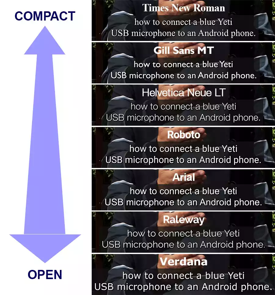
ARIAL
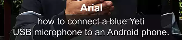
Arial must be a contender since it is extensively used around the globe, so it’s a winner in terms of familiarity for the viewer. It also has a clear and simple design that makes it a good choice as a caption font. The regular typeface looks good, but even Arial Narrow is easy to read while allowing a higher word density. Arial is certainly a favorite choice for many designers.
Gill Sans MT
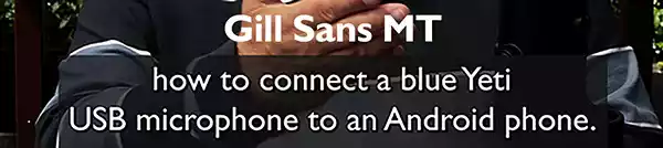
Gill Sans rocks. Since its release in 1928, Gill Sans has been a favorite in British design, with British railways using it extensively. Eric Gill, the designer wanted to create a typeface that had a clean modern look while also having a classical feel. It’s familiar, especially in Britain, and is easy to read.
Helvetica Neue LT
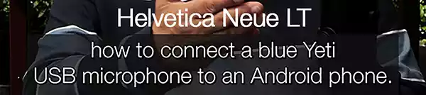
Helvetica is the font of choice for many publishers and broadcasters and is available in several typefaces. It may have its roots in the 19th century but still looks clean and strong. This font certainly qualifies to be considered for use on any subtitles, but there’s a problem. Helvetica is a commercial font and is not bundled with Windows or macOS. Nor is it available via Adobe’s TypeKit. If you want to use Helvetica, you’ll have to buy a license, but you may think it’s worth the cost.
Raleway
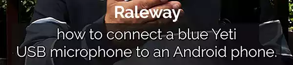
Raleway seems more sophisticated than plain old Arial, but not so much that the design would draw attention to itself. It’s refreshing, open, and easy to read, although the typeface is not as solid and open as Verdana. Even so, it has a pleasing appearance and is a good choice for subtitles.
Roboto
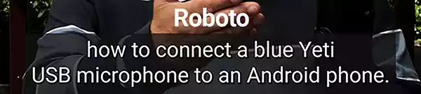
Roboto is YouTube’s default subtitle font, which should tell you a great deal about its suitability as your subtitle font. It has an open, clean, and simple design, and in terms of familiarity, it must have been seen billions of times on YouTube alone. If you are going to use Roboto for your subtitles, just made sure you choose the Regular or Medium weight.
Verdana

Times New Roman dates from the 1930s when the typeface was commissioned by the British newspaper The Times. It has a solid design, but with a traditional and elegant tone. This popular typeface may have a very British origin, but it can now be found just about everywhere, including on most computers. Of all the fonts in this list, New Times Roman is the most economical in terms of screen space. So, if your subtitles are text-heavy, this font could be a good choice for you.
Comparing the fonts for openness
One criterion that determines how easy a font is to read is its level of openness (or compactness). However, this isn’t the whole story. Some compact fonts can also be easily read because of their design and the fact that we have grown used to seeing them because of their ubiquity.
All 7 fonts I’ve mentioned are good for subtitles, but they are not equal in terms of openness.
Look at the following graphic. I have used each of the fonts for the same graphic, and you can see the amount of screen space varies. New Times Roman is most economical in terms of screen space, whereas Verdana uses much more, even though the font size is the same in each case.
Why would you choose a font based on its openness?
There are at least two reasons.
First, the size of the screen the viewer is using makes a difference. A compact font can be more difficult to read on a phone screen than an open font, even though it can be easily read on a laptop or desktop computer display.
Secondly, depending on the pace of the dialogue, the word density in the caption will vary. Captions for a slow speaker will contain fewer words in a set length of time than captions for a fast speaker. So, a compact font can be useful for faster dialogue, because it takes up less screen space on the screen and therefore more words can be included.
Exporting your video captions
If you have followed along with this article, you should now have a set of captions or subtitles that should not only look attractive but also enhance your audience’s viewing experience. The next step is to export your video and subtitles. I’ll lead you through the process in my next article: How to export subtitles or captions in Premiere Pro.
Frequently Asked Questions
What is the best font size for subtitles?
There is no set font size for subtitles. They should be large enough so that they are easy to read but not so large that they start to obscure the video content. I find that in Premiere Pro, setting the font size to about 70 produces subtitles that are easily readable on most devices.
What color is best for captions and subtitles?
The font color should contrast with the video content and make the captions easy to read. Generally, white or black works well since the subtitles are not meant to draw the viewer’s attention away from the video content. If necessary, place a semi-transparent background block, with a contrasting color, behind the text.
Should you add a drop shadow to the text?
Adding a slight drop shadow to your caption text can make them appear clearer, especially if the contrast between the text and the background is only moderate. Use gray for the drop shadow color and set the opacity to about 70%.
You might also like…
- How to Create Subtitles or Captions in Premiere Pro
- 10 ways to improve transcription accuracy in Premiere Pro
- How to Transcribe Audio in Adobe Premiere Pro
- Auto Transcribe Video to Text Free of Charge: 7 methods tested
- How to export subtitles or captions in Premiere Pro
- How to repurpose videos into audio & text content with Premiere Pro
Tosh Lubek runs an audio and video production business in the UK and has been using the Canon EOS R since it was released in the Autumn of 2018 and the Canon EOS R6 in 2020. He has used both cameras to shoot TV commercials broadcast on Sky TV, promotional business videos, videos of events and functions, and YouTube creator content. He has also won several international awards for his advertising and promotional work. You can meet him by visiting his “video booth” at HashTag Business Events across the country.
Recent Posts
Most people use sandbags the wrong way. Here’s how to hang them properly on a light stand for maximum stability and safety — plus what to fill them with.
You're Using the Canon RF 50mm f/1.8 WRONG! Here’s How to Fix It
If you’ve recently picked up the Canon RF 50mm f/1.8 STM—affectionately known as the Nifty Fifty—you might be confused by that strange switch on the side of the lens. It doesn’t say AF/MF...